Commercial credit

Product design
client
RBC
Project type
Product design
Project year
2020

The ask

In preparing for a client call, commercial business advisors had to fetch information
about their client one piece at a time…from 26 different systems. The ask was to build a consolidated view that speeds up pre-contact planning. In other words, a contact list. It would enable time for discovery and identifying risk sooner.

The insight

Behind every strong woman (working) at the bank, there are legacy systems that look like Windows 97. Advisors are spending too much time on administrative minutiae, which directly translates into a high turnover rate.
concept

Beyond the ask

Eight months of research uncovered issues at every step of the advisor's workflow. Think of it this way. It's like trying to message a friend from your freshman year on Facebook, except... First you need to search their full name in your high school diary. Then search their contact on Yellow Pages. And verify with Google that they're in the the one you're looking for.

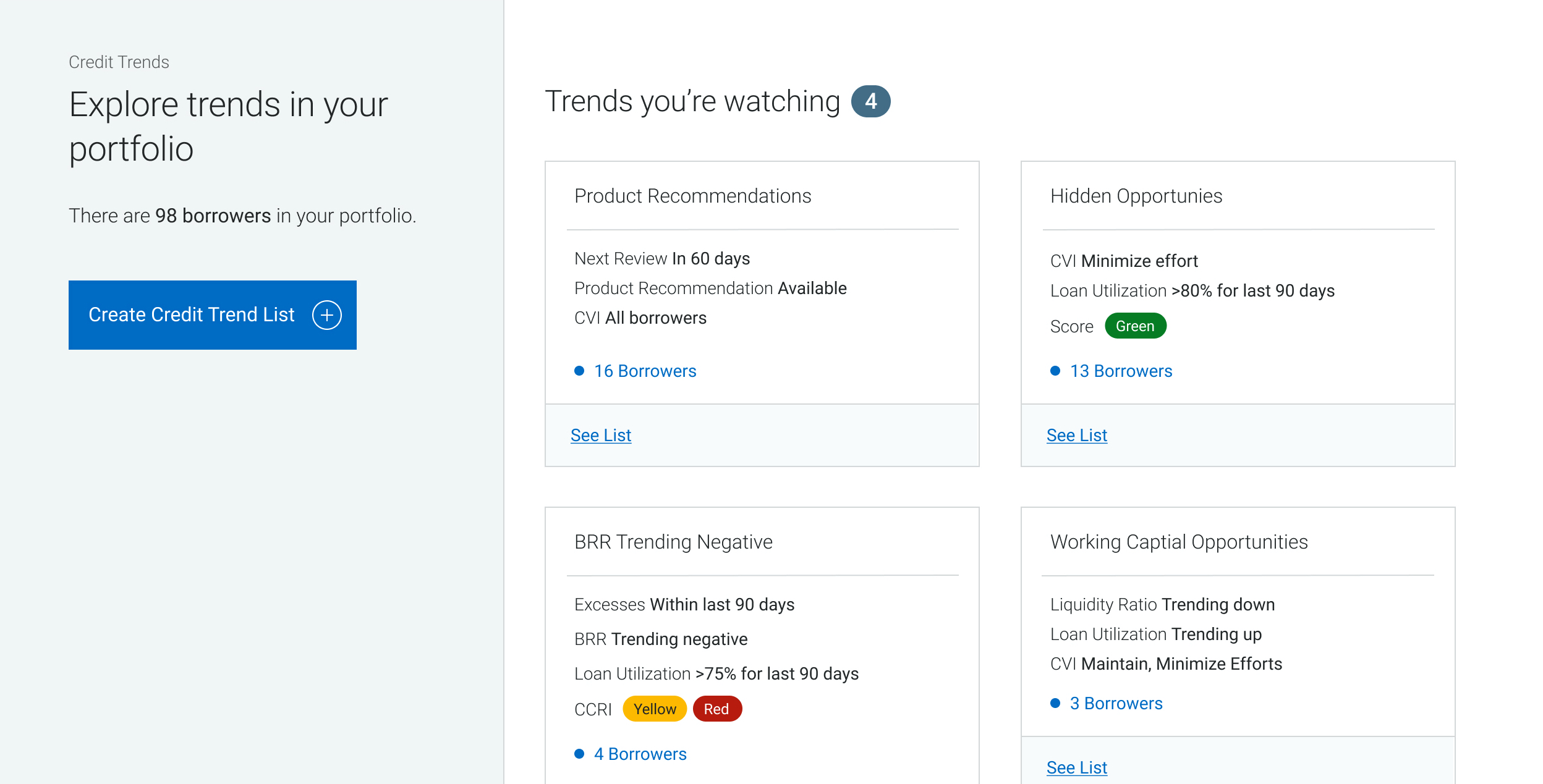
All this before even sending a poke. We looked at all the current processes and came up with a concept complete with database search, criteria filters, user set tagging, and trending category tool.

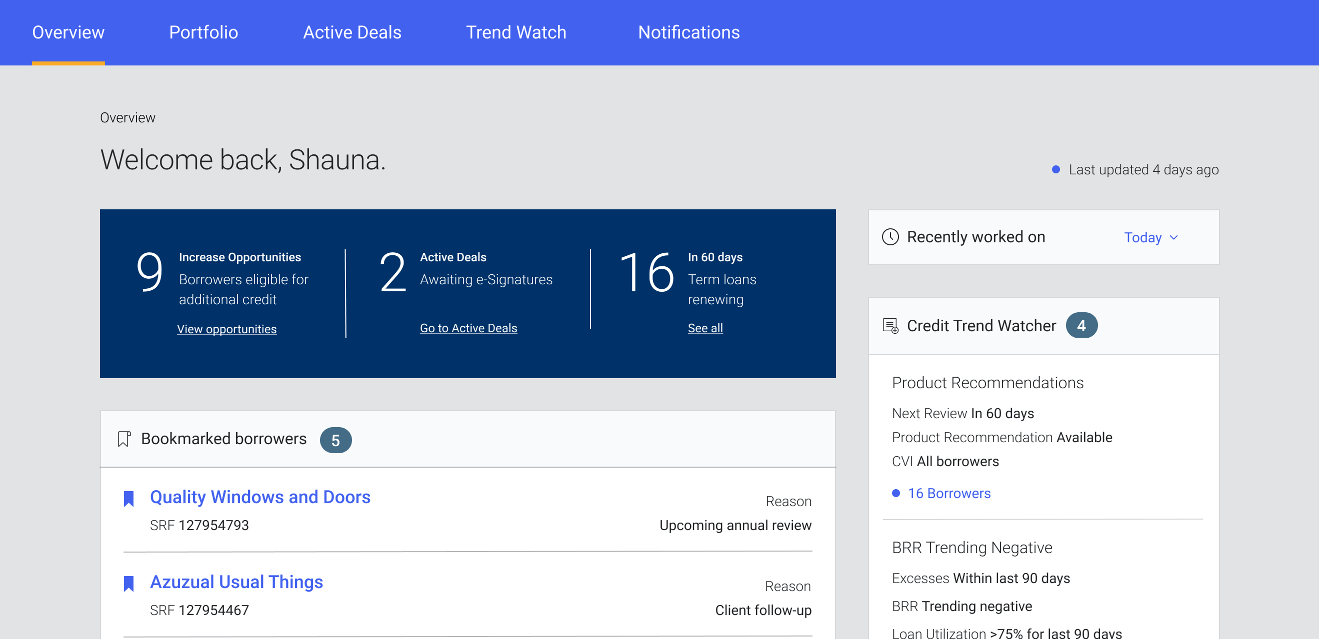
Dashboard

A home page designed to prioritize pressing issues and upcoming items. Switch from actively seeking to having important action items highlighted by the backend, eliminating the need for manual task planning.

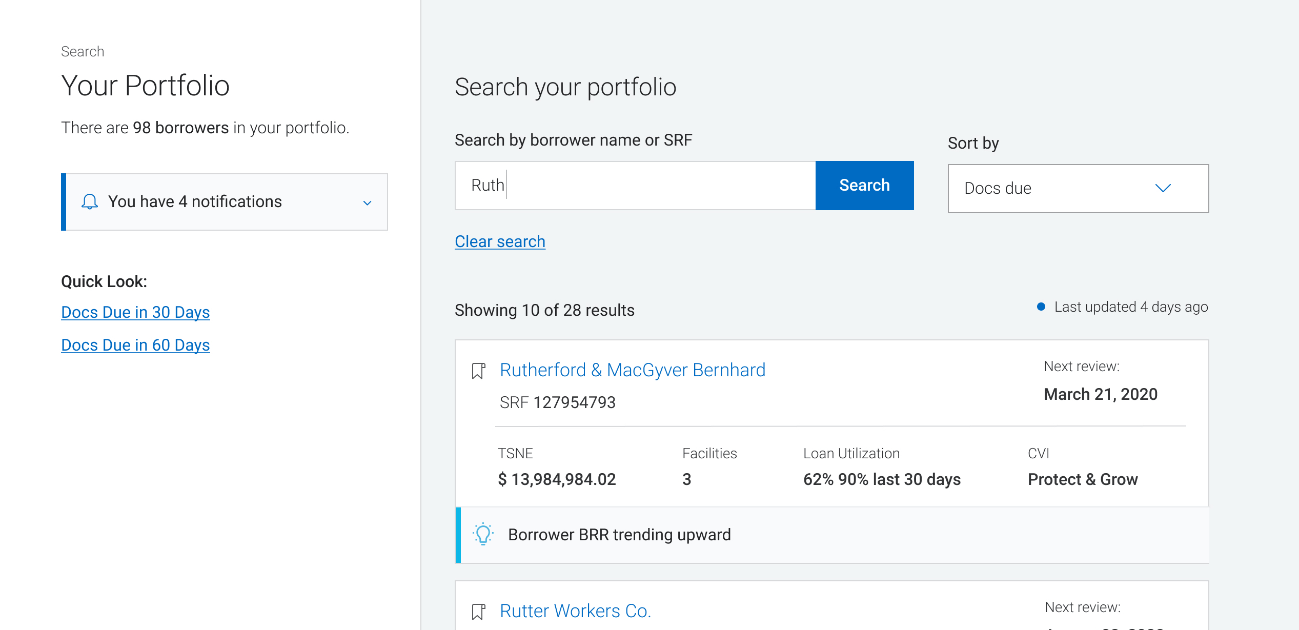
Portfolio

A list of clients that surfaces key business identifiers and opportunities. A searchable list (whoa) that surfaces upcoming credit events by importance from the business goals.

Depending on the fiscal year season, the advisor's tasks shift dramatically. So it's important to give them the ability to shift focus and sort clients based on the next important event. Examples of this would be - pending documents for a deadline, upcoming review, etc.

Trend watch

A feature that turns what is currently deemed “problematic” into missed opportunities. This eliminates manual client ranking and creates the ability to analyze credit trends.

The old system let advisors apply a risk factor tag to a client. The issue with these is they were one dimensional. A client that is deemed risky in one industry might not be in another.

An example would be - agricultural companies that are experiencing a draught. It doesn't necessarily apply to the entire sector, and is also temporary.

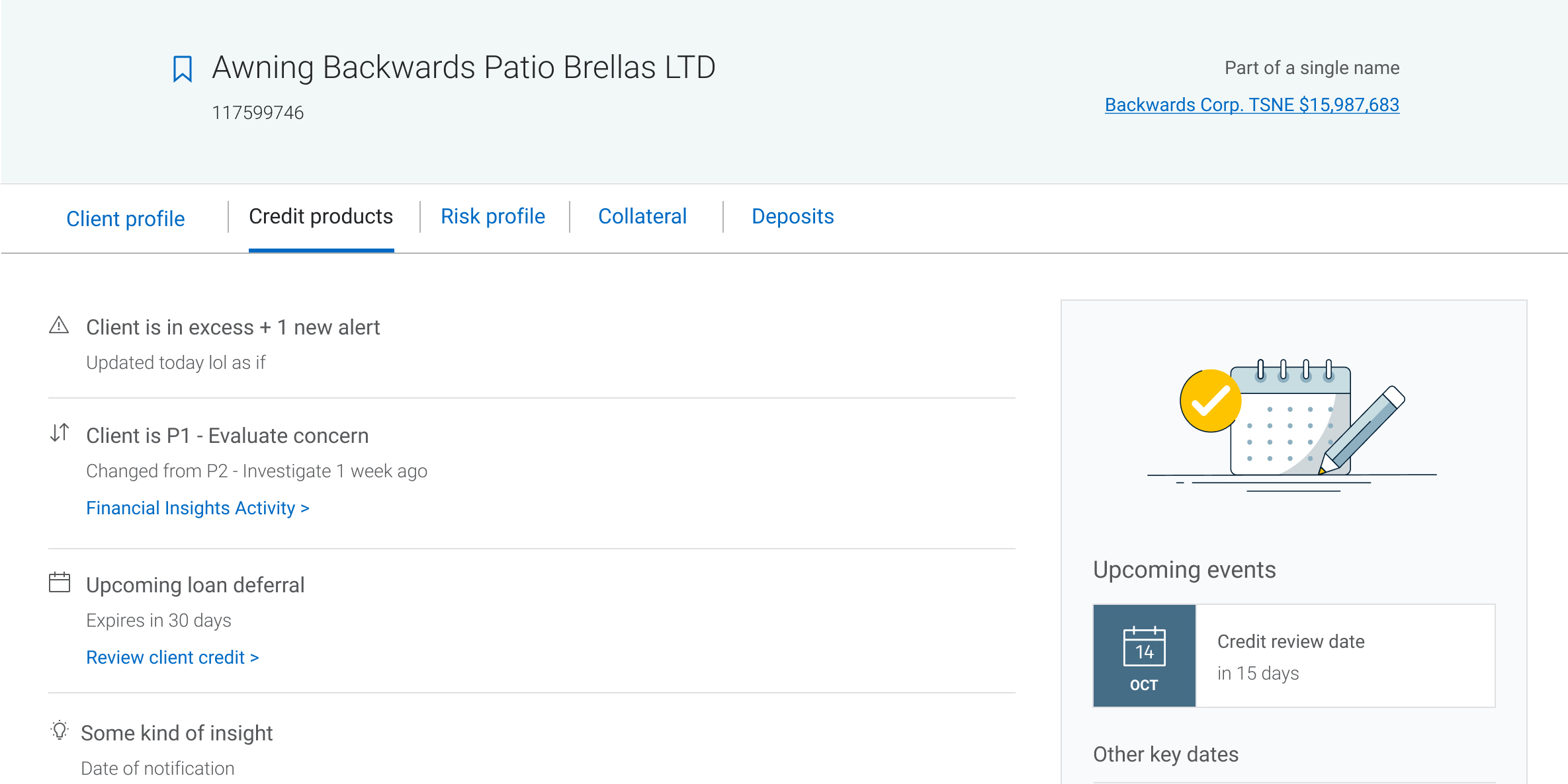
client view

A complete overview of each client's relationship with the bank. Previously the advisor view would be limited to credit products they have. But that offers a very narrow view of finances, especially in industries that rely on larger cash deposits.

Being able to see their products outside of credit, means more meaningful and servicing better product recommendation.  
pivot

Enter COVID-19

Focusing on a proactive approach seems like a great idea in every case besides one of a global pandemic. As a result of borders being shut down and businesses suffering, the focus quickly shifted to risk mitigation.

Understandably, the need for advisor efficiency during a crisis became dire. This meant that we had to open up the gates to new types of users we knew little about in order to streamline solutions for business owners. Treasury solutions, adjudication, risk management all had a role to play and we needed to make sure our tool worked for everyone.
Risk assessment approach means reactionary features.
When focus turned to adjudication, even the original ask of a client list was de-prioritized. We saw a shift in the mental modal from discovery and opportunity seeking to issue detecting. In our first interview with adjudicators, we learned right away that they had no need to it. This was an important first learning for the broader team.
Adding User types without research means no dynamic content.
As we rushed to deliver value in the first months of the pandemic, the specialized tool was molding into a one stop shop. It ultimately ended up creating a connection between various roles. For example - providing a single client overview for an adjudicator and advisor working together streamlined their communication in an unexpected way.
Displaying a lot of alerts and issues means no focus.
Government emergency loans, overdue balances, special measures have made our product into a page full of alerts. Without hierarchy and structure, it was time to stop and talk scalability.
scalability

Object oriented UX

The product was gaining traction and more stakeholders wanted to integrate with us. We've spent 6 months building what we called a "sticker album", and if we expected to continue expanding at the same rate we had to prepare. Designing for scale starts with an information architecture that can support content and structure as needed.
🛋
Content

What we had was a lawn full of furniture

Pitching it this way to our stakeholders really helped drive the point across. We had a lot of features on one page with no intent. Comparable to leaving all of your belongings out on the lawn.

🏠
Structure

What we needed was a decorated home

You wouldn't put a couch in the bathroom - these are your UX best practices. You don't need a candle room, but a candle here and there will create a mood. These are the reusable pieces throughout our product.

Architecture has always been a great metaphor for product design. Outside of our own house, there was the city to consider. Doing an object oriented UX exercise with the broader team within our journey highlighted a lot of overlap we had not yet considered. These few months would set us up for success in the next quarter.

In conclusion

We set out to lower the amount of places advisors need to check when prepping for a call. No one had anticipated it, but we ended up improving the processes between several internal roles. And that, was arguably a much larger task.

The pivot ultimately turned into a major spike in our user base. Since launching in July 2020, the product grew from 2,000 users in the first month to over 3,500. We also noticed a strong pattern of repeat usage, which ultimately went on to become a success indicator across the journey.

Other projects

Product design
Affordability benefit
Product design
Online retail store
UX design
Health insurance provider