A pharma brand site has to survive review before it meets users.
How I designed the ORZEYFUL brand site for Takeda inside an agency review process: audit the design system first, treat review rounds as design work, and start developer handoff early. ORZEYFUL is a prescription medicine for narcolepsy type 1 in adults.
Client
Takeda · ORZEYFUL
Role
Senior Product Designer
Capabilities
Design system governance, accessibility, developer handoff
Launch
November 2026
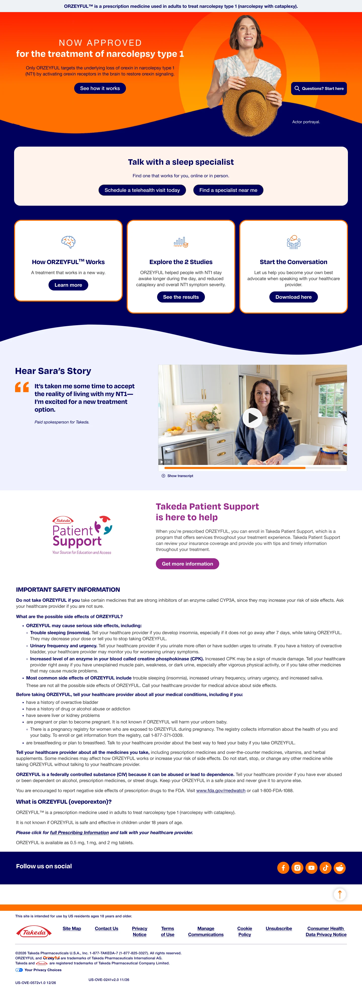
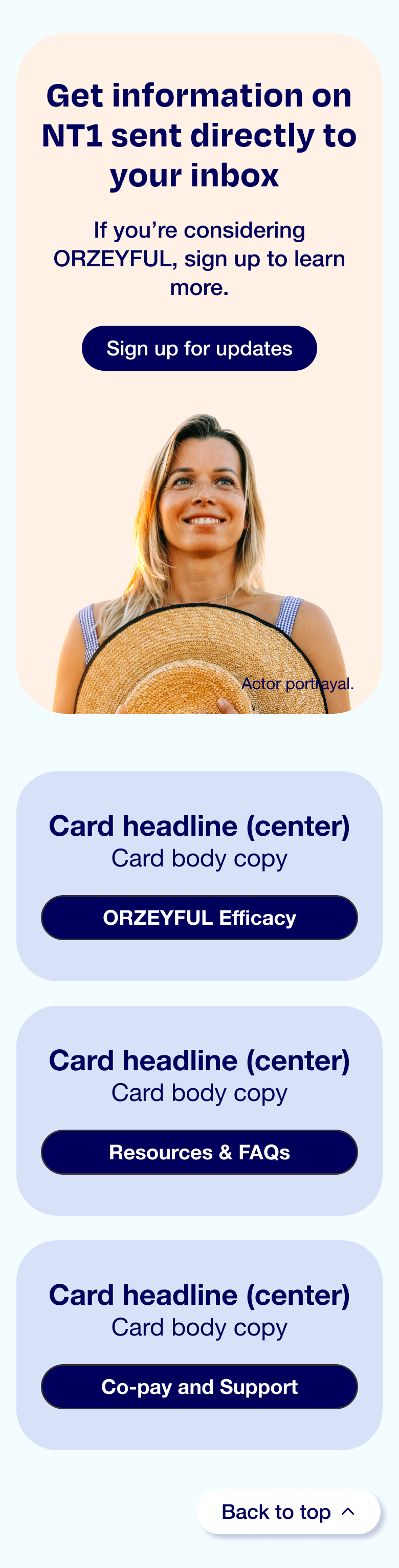
ORZEYFUL · Homepage, mobileThe indication sits under the header on every page, and Important Safety Information follows the content.Scroll inside the phone to see the full screen.
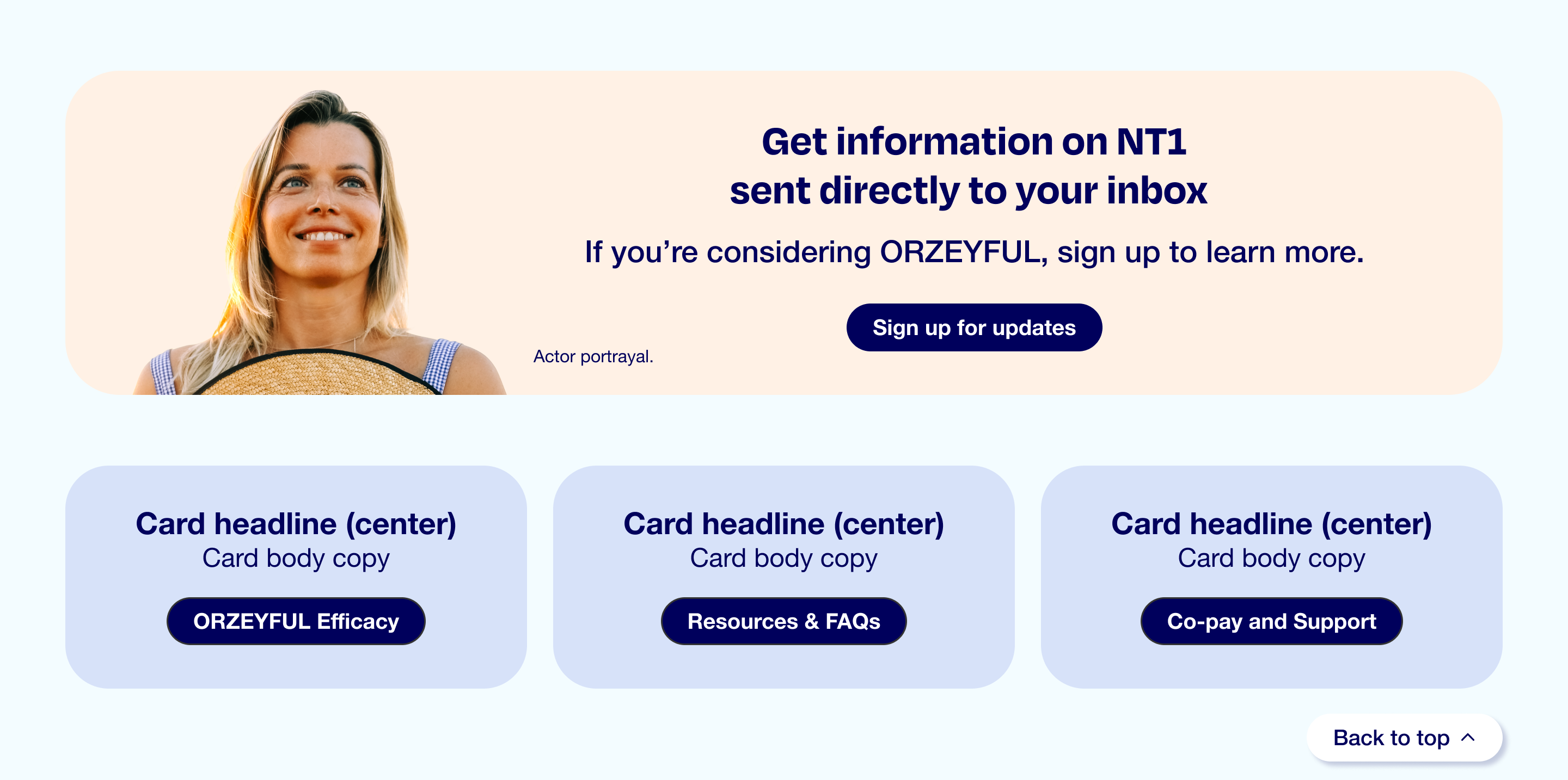
ORZEYFUL · Homepage, desktopScroll inside the frame to see the full page.
3 phases
Three phases of the site designed
1 system
One design system, used across ORZEYFUL work streams for healthcare providers and patients
Live
Public since November 2026. Process figures are drawn for this page1
01 / The problem
The brief counted pages. The review route set the schedule.
Takeda needed a brand site for ORZEYFUL, a prescription medicine for narcolepsy type 1 in adults. The ask arrived as pages and copy. It did not list how often each page would be seen.
After wireframes, the work moves through one loop. I export a PDF and the project manager uploads it. Each discipline marks it up. I apply the change or push back. Editorial checks punctuation, references and approved language, and legal reviews. Then it repeats. This site went through more than 12 rounds of legal review. Four constraints sat around it.
01
Regulation
Important Safety Information (ISI) is strictly controlled by legal, and every page passes editorial and legal review.
02
Time
The release date ran backwards. About a month before it, my focus had to move from design to handoff.
03
Technology
The parent design system was of unknown maturity, the hosting platform might be unfamiliar, and developers were wary of custom work.
04
Organization
Email, healthcare-provider sites, client-facing sites and marketing pages ran as parallel streams, each with its own creatives.
Scope was not the page count. It was the number of times a page had to be defended.
04 / The decisions
Three decisions that shaped the site.
01
Spend custom components like a budget, with a reuse case for each
I read the parent design system file before drawing pages. Each element was used as it is, composed from a foundation piece such as a card plus smaller parts, or requested as custom with a rationale for reuse. Developers resist custom work, so the conversation started from a written list.
Trade-off
Audit time up front, and more scope when the parent system is thin.
1 · As isAlready in the parent systemUse it unchanged.
2 · ComposedBuilt from foundation piecesA card plus smaller parts: list, title, copy, button.
3 · CustomRequested with a reuse caseOnly as many as developers can absorb.
Illustrative. Drawn for this page; not a client file.
02
Get down to what the client is asking for, really
A client request reaches me as a solution: add a tab, to shorten the page. I ask what it is meant to fix, explain what a tab does to the reader, and offer a different solution to the same goal. What we agree goes to the project manager with the reason, where the team can find it later.
Trade-off
More time in the meeting, and a team asked to learn some UX vocabulary.
Decision log entryRequest · Underlying goal · Options considered · What was agreed · Who was told
Illustrative. Drawn for this page; not a client file.
03
Check accessibility from the start
I check colours, fonts and features against WCAG.2 In a regulated setting, it lowers lawsuit risk and widens adoption.
03 / The craft
Handoff gets its own month, and it starts with a clean file.
I count back from the release date and reserve about a month, at least, for handoff. Before that, I ask developers about their environment, their component library and which custom components are feasible. In the handoff file, every element links to a token, layers are named, and the hierarchy mirrors code.
QA sends questions and behaviour mismatches. I reply with the intended behaviour and tag the right people. In production, I click every button, check that links open in the right window, and test scrolling. Agreed fixes and dropped items go in one email.
01
ISI
Safety information is regulated by legal, so placement and navigation follow the client's existing sites.
02
Legal calls
When I am invited, I join, ask questions and learn who is in the room. That lets me head off suggestions that would cause problems later.
03
Utility states
Error pages, thank-you modals, expand modals, interstitials and loading states, designed at intake because teams rarely list them.
04 / The site
Four efficacy measures share one page structure.
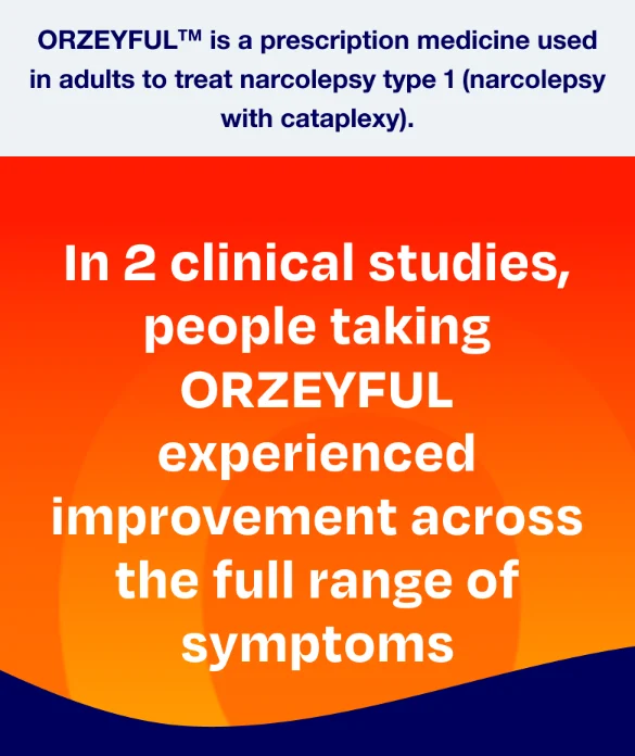
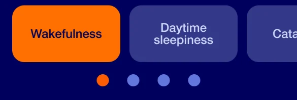
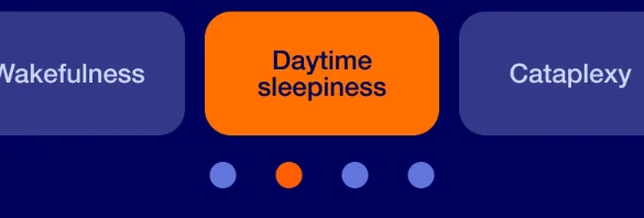
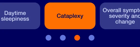
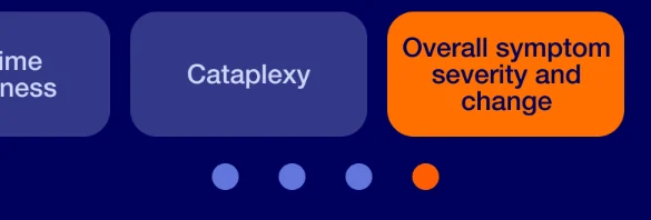
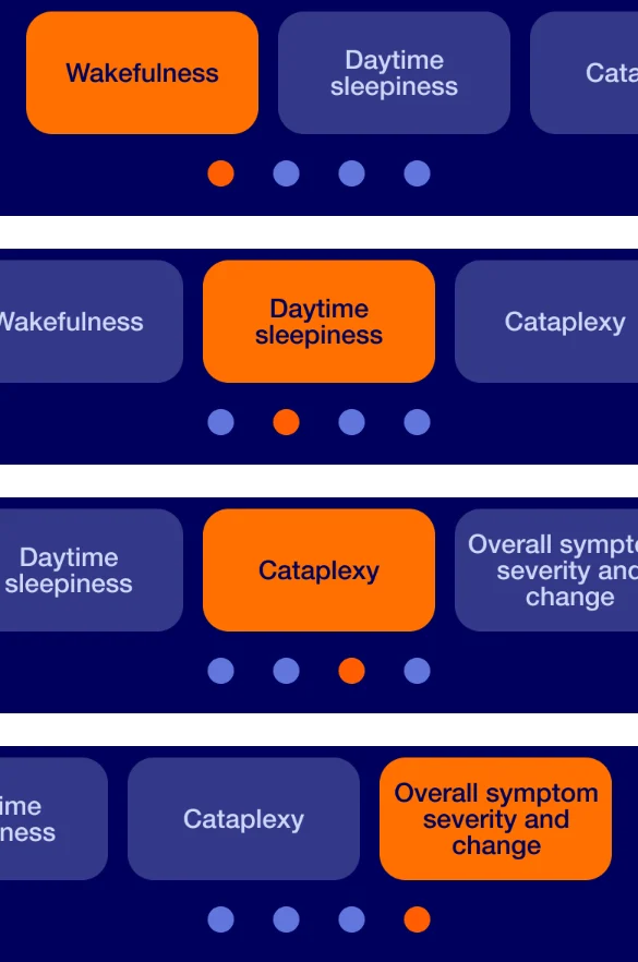
The efficacy page reports four measures from two clinical studies. Each measure is a tab at desktop size and a carousel slide at mobile size. The page under it keeps the same order: study design, results, sign-up, safety information.
Efficacy page at mobile size. Design comps.Scroll inside the phone. The tabs in the design switch the measure.
Efficacy navigation at mobile size, four states. A carousel with position dots.Tab rows from the design comps.
Sign-up band and link cards, desktop and mobile. Each is a card with a title, copy and one button.Component sheets from the design file.
05 / Reflection
A pharma website has real limitations, and it is hard to advocate for the end user.
The design system was created to be used across all ORZEYFUL work streams, for healthcare providers and patients alike. Three phases of the site were created.
The site has been live since November 2026. Results from this engagement are not mine to publish until they are cleared by the agency and the client.
In conversation, I can go further into the artifacts and the reasoning, within what the agency and client permit.
Credits and sources
This page shows method and screens from the launched site.
Role. Agency engagement on the Takeda account. I owned the design-system audit and component triage, type tokens and colour rules, WCAG checks, the handoff file and production test, and Figma coaching for a junior graphic designer.
Credits. I worked with a product lead, a project manager, strategists, copywriters, an account team, an art team, external developers and QA.
Clearance. Client and product are named now that the site is public. Screens are design comps of the launched pages. Process figures are illustrative and drawn for this page.
Practice described from the author's own working notes on this engagement; not independently verifiable. ↩